Leadership Intelligence Dashboard.
A health-pulse dashboard for Citi's senior leadership, built fast, under deadline, to give them transparent visibility into risk and controls compliance.
source of truth.
| Priority | Issue ID | Issue Name | Owner | CAP Owner | Due | Source | Status |
|---|---|---|---|---|---|---|---|
| High | ISS-001 | Access review backlog | Team A | Team A | Q2 24 | Audit | Overdue |
| High | ISS-014 | Control mapping gap | Team B | Team B | 30 d | Self-ID | In Progress |
| High | ISS-019 | Segregation of duties | Owner | Team C | 30 d | Audit | In Progress |
| Medium | ISS-022 | Vendor risk refresh | Owner | Team A | Q3 24 | Review | On Track |
| Medium | CAP-042 | Policy exception review | Team C | Team C | 45 d | Self-ID | In Progress |
| Medium | ISS-028 | Evidence completeness | Team B | Team B | Q3 24 | Audit | On Track |
| Low | ISS-037 | Evidence collection | Team A | Team A | Q3 24 | Review | On Track |
| Low | CAP-051 | Remediation sign-off | Owner | Team C | 60 d | Self-ID | On Track |
| Metric | MTD | Target | Var | YTD | St |
|---|---|---|---|---|---|
| Throughput | 1,284 | 1,300 | −16 | 14,802 | |
| Cycle time | 4.2 | 4.0 | +0.2 | 4.1 | |
| Defect rate | 1.8% | 2.0% | −0.2 | 1.9% | |
| Capacity | 92% | 90% | +2 | 91% | |
| SLA met | 96% | 95% | +1 | 95% | |
| Rework | 3.1% | 3.0% | +0.1 | 3.2% |
| Category | Low | Med | High | Crit | Total | %Δ |
|---|---|---|---|---|---|---|
| Network | 12 | 6 | 2 | 0 | 20 | +4% |
| Endpoint | 8 | 4 | 1 | 0 | 13 | −2% |
| Identity | 5 | 3 | 0 | 0 | 8 | +1% |
| Cloud | 9 | 5 | 3 | 1 | 18 | +9% |
| Application | 7 | 4 | 2 | 0 | 13 | +3% |
| Severity | MTD | Prev | Target | Var |
|---|---|---|---|---|
| Sev 1 | 2 | 1 | 0 | +2 |
| Sev 2 | 6 | 5 | 5 | +1 |
| Sev 3 | 14 | 16 | 15 | −1 |
| Total | 22 | 22 | 20 | +2 |
| Region | Active | New | Closed | Aging | % Overdue |
|---|---|---|---|---|---|
| Region 1 | 18 | 4 | 11 | 9 d | 12% |
| Region 2 | 24 | 6 | 9 | 14 d | 18% |
| Region 3 | 15 | 3 | 14 | 6 d | 8% |
| Region 4 | 20 | 5 | 12 | 11 d | 15% |
| Total | 77 | 18 | 46 | 10 d | 13% |
| Measure | Actual | Target | Gap | Progress |
|---|---|---|---|---|
| Issue closure | 84% | 90% | −6 | |
| Control coverage | 91% | 95% | −4 | |
| Evidence rate | 78% | 85% | −7 | |
| On-time rate | 88% | 90% | −2 |
The brief
A pulse check, under deadline.
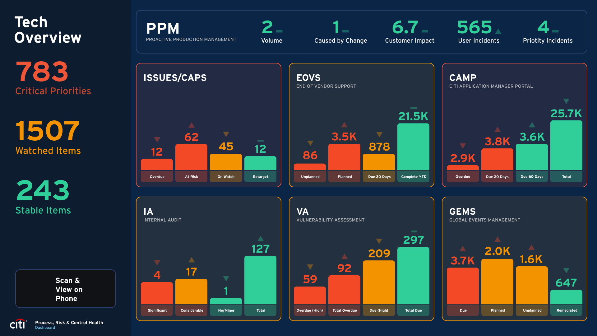
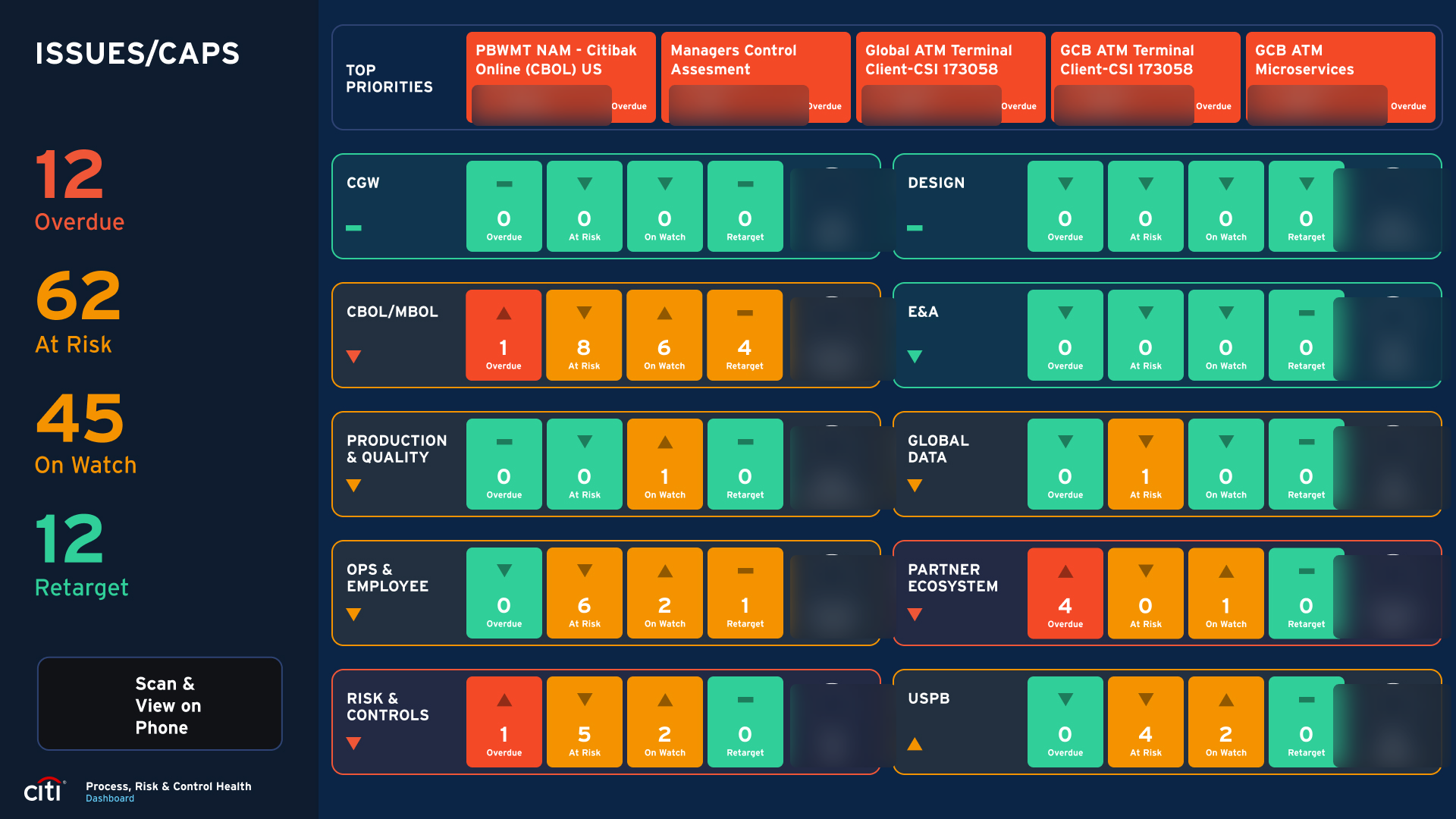
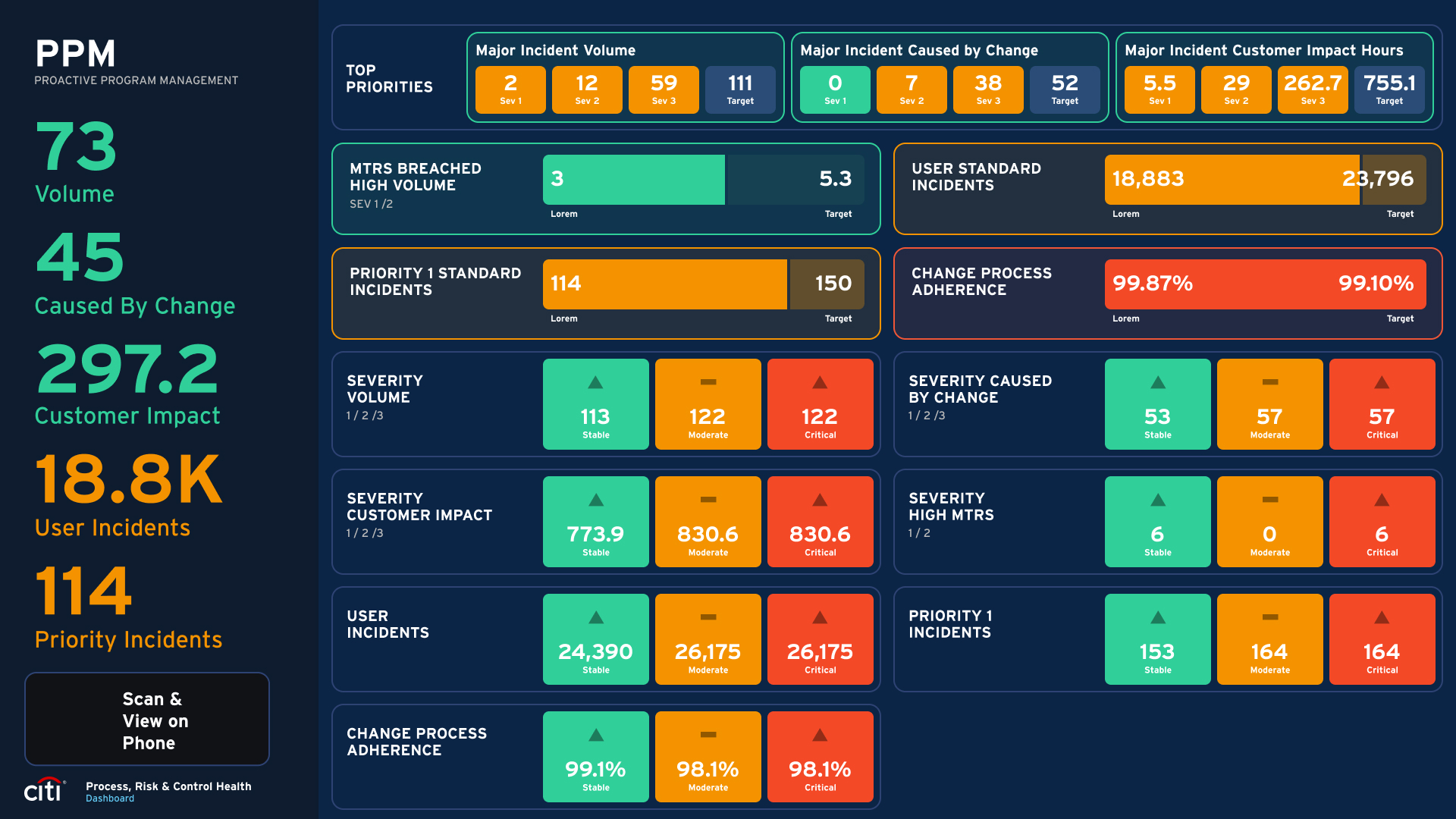
PCR Health was a high-priority project. Senior leadership needed a comprehensive internal reporting dashboard to quickly assess how their domain was performing on compliance with risk and controls, a health pulse for the program, with immediate insights they could act on.
The real challenge wasn't the data. It was the timeline. The tool had to ship fast, meet the high standards of senior stakeholders, and still feel calm enough that an MD could read it in two minutes between meetings.
There was also a dimension to this project that most design work doesn't have. A dashboard that shows your own program's health to your own leadership team is inherently sensitive. Data that's good news is easy. Data that shows problems requires careful thought about how it's framed and surfaced, the design had to be honest without being alarmist. The design process had to match the urgency of the ask without sacrificing that care.
The research
Fast research, clear priorities.
With the clock ticking, I engaged stakeholders immediately to gather context: what mattered most, what "good" looked like to leadership, and where the existing reporting was failing them. There wasn't time for a long discovery phase, the discovery had to happen alongside the design.
I ran rapid ideation in parallel: multiple concepts explored quickly to test different ways of expressing program health, then put in front of stakeholders within days, not weeks. The bar was deliberately low for fidelity and high for speed of feedback.
The working principle was a fail-fast mentality: iterate quickly, cut the ideas that didn't land, and refine the ones that did. The goal underneath all of it was clear, give leadership transparent visibility into compliance with risk and controls, in a form they could read at a glance.
The shift
From data to decisions.
The path was agile by necessity. Early wireframes and low-fidelity prototypes went to stakeholders within the first weeks, not the first month. Their feedback was integrated immediately into the next round, with constant communication so no one was surprised by the direction. When something didn't work, we cut it the same day.
The core design decision was hierarchy. Everything in the interface was organized around what leadership needed to know first, program health at a glance, with trend context always visible alongside point-in-time numbers, and deeper data available on demand with one click. The front door was always a summary, never a chart wall.
The final round was high-fidelity prototypes for senior leadership review. The polish lived at the end of the process, not the start, which is the only way design under deadline stays honest.
The outcome
Shipped on time, used by leadership.
The dashboard shipped within the tight timeframe leadership had set and received positive feedback from senior stakeholders. By the next review cycle, it had replaced manually compiled reports for most teams, because it told the same story faster, with the underlying data one click away when someone asked.
The shift from periodic reports to real-time access changed the nature of leadership conversations. Instead of reviewing what had happened last month, conversations became about what was happening now, and what to do about it. That improved leadership's ability to track and manage compliance issues in flight rather than after the fact.
What I took with me
Adaptability is a design skill.
I also learned that designing for executives is harder than it looks, not because the design problems are more complex, but because access is limited. Most of my research on this project was done with delegates rather than the executives themselves. There is a version of this dashboard that has been truly validated against the people reading it every morning, and that version would probably look different in important ways. That is the honest next step.
This project taught me that adaptability is a design skill, not just a personality trait. When the timeline is tight and the audience is senior leadership, the ability to move fast, communicate clearly, and make the right call without perfect information is as important as what you put on the screen.