Café Bella
Aurora.
Building a coffee brand on four generations of family harvest in Dipilto, Nicaragua, the side project where I get to be client and designer at the same time.
The problem
Four generations of my family's coffee were sold anonymously to commodity buyers.
What I did
Co-founded the brand and led all creative direction: identity, packaging, labeling, and a story-first e-commerce site.
Impact
Live and selling across the United States, reaching customers directly with our own story.
The brief
From a family farm to a brand.
My father is a coffee producer. He grows it on a small farm in Dipilto, Nicaragua, the fourth generation in our family to make coffee for a living. The farm is called Bella Aurora, "beautiful dawn," the moment the pickers start each morning. For decades, that harvest left the farm and disappeared into commodity buyers who blended it into anonymous bags.
In 2021, my siblings and I decided to change that. The goal was simple to say and hard to do: turn four generations of work into a brand that could reach customers directly, tell our family's story in our own words, and give the coffee we'd grown up drinking a name on a shelf.
There was no brief. No client. Just a product, a story, and a designer who had never run a business. I gave myself one rule: build it the way I'd want a real client to build it.
The approach
The brand had to be true first.
I started inside the story before I touched any visual decision. Long calls with my dad about the farm. Conversations with my siblings, spread across different states, about what we wanted Bella Aurora to mean outside the family. A deep dive into our coffee legacy: four generations of choices, methods, and small rituals that made the harvest ours.
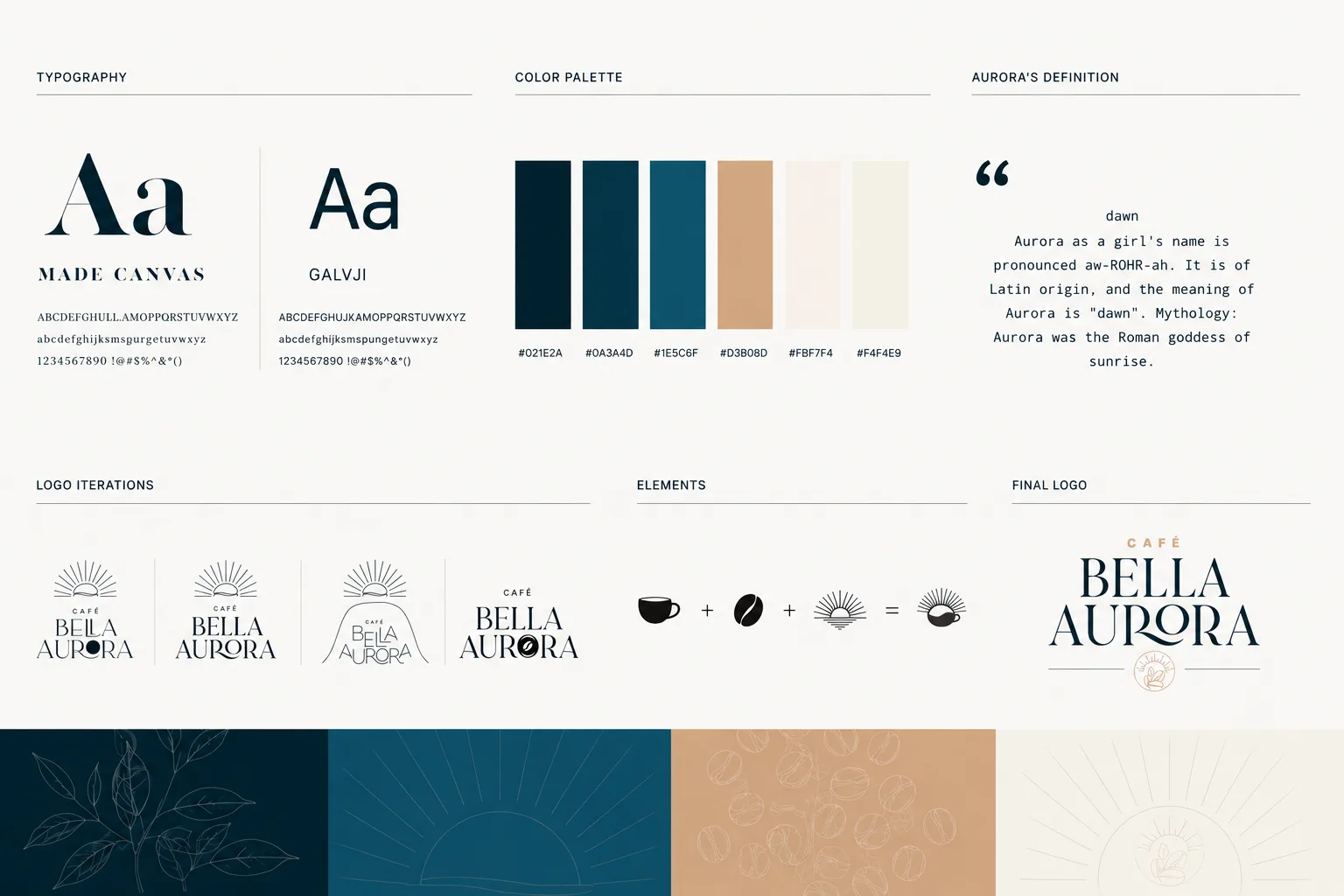
For the logo, I led the creative direction and brought in a graphic designer I trusted to execute alongside me. Working with another set of eyes kept me honest. It was easy to blur the line between what was nostalgia and what was a good brand decision. The mark we landed on nods to Central American craft without being literal about it.
The color palette came out of a long exploration grounded in color theory: warm, earthy tones that convey artisanal quality and heritage, rooted in the rich tones of coffee beans and the landscapes of Nicaragua. Every design decision had to pass one test: does this feel like it belongs to our family, or does it feel borrowed?
The full brand system sits on three legs: family heritage, Nicaraguan identity, and the rhythm of the harvest.
The build
Brand, packaging, store, repeat.
Then came the system: typography and brand elements that stretch across packaging, web, social, and print, with rules and templates so the brand can grow without redrawing every asset.
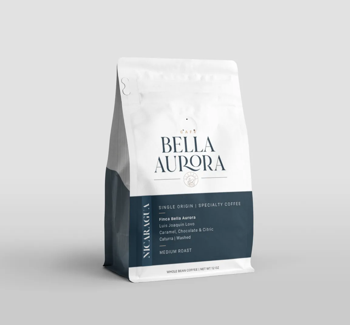
Packaging was the highest-stakes piece: the bag is what someone holds, photographs, and keeps on their counter. It had to protect the beans, stand out on a shelf, and carry the brand at a glance. The final design layers the logo, the brand colors, and heritage elements drawn from the farm. Every label tells the practical story too: origin and tasting notes on every bag.
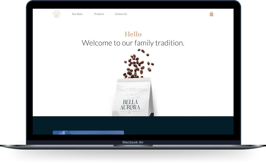
Most e-commerce sites lead with the buy button. Ours leads with the story: the family history and the character of the coffee come first, with a clear path to purchase. The storefront runs on Wix.
The outcome
From farm to shelf.
What started as a long conversation with my dad is now a complete brand, designed end-to-end: identity, packaging, labeling, and web. For the first time, our family's story reaches customers directly, in our own words.
generations
What I took with me
Designers should ship something they own.
Bella Aurora taught me product lessons no meeting room could. Pricing, supply chain, customer support, shipping logistics, inventory: the unglamorous reality of making something exist in the world. And a lot of coffee tasting along the way.
Every designer I know who has run their own small thing has better instincts because of it. It is the closest you can get to feeling what your stakeholders feel, and that changes how you design everything else.