MCA Risk & Controls Dashboard.
Redesigning the daily tool of 300+ risk analysts at Citi, replacing an Excel-based workflow with a modern web application that gave analysts real visibility into ARCM quality.
The brief
A tool people tolerated.
MCA, the Manager's Control Assessment, is how Citi tracks operational risk across every business line. The legacy tool asked analysts to manage ARCM (Activity, Risk, Controls and Monitors) quality assessments, flag items, and disposition them, all inside a cumbersome form-and-table interface that pushed people to keep their real notes in spreadsheets on the side. The dashboard wasn't broken. It just wasn't trusted.
The goal was concrete: replace the Excel-based workflow with a modern web application that gave analysts transparent visibility into ARCM quality and an efficient way to report and track flagged items, without breaking compliance, losing data, or forcing 300 people to re-learn their day job overnight.
I was brought in as the product designer on the team. It was a complex domain I had never worked in before, and the first challenge was understanding it well enough to design for it.
The research
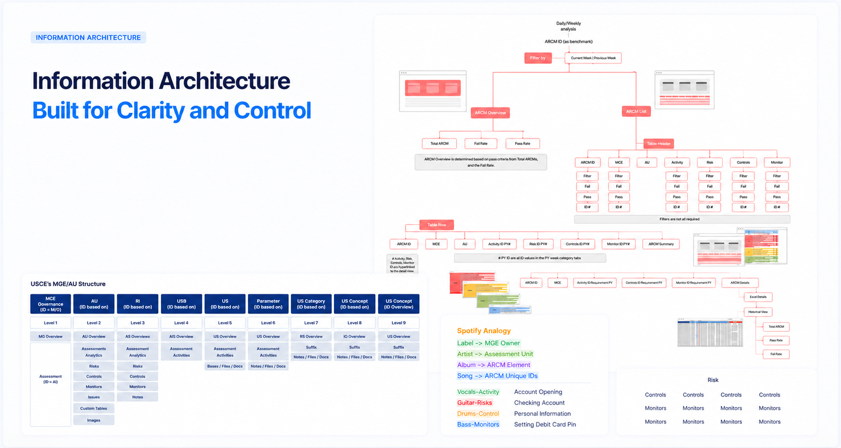
Starting in the data, not the screens.
Before any wireframes, I went deep into the raw data, mapping the structure of an ARCM, the fields that mattered, the relationships between assessments, and the metrics that actually moved over time. I needed to understand the domain well enough to make real design decisions, not just decorate the interface.
Alongside the data work, I ran stakeholder interviews with business partners and end users, gathering requirements, surfacing pain points, and defining what success looked like for both analysts and leadership. Those conversations led to a clear objective: give users a transparent view of which ARCMs needed assessment and the historical health of every ARCM over time.
A few things became clear early. Analysts didn't need more data, they needed to know what required their attention and be able to act on it without exporting anything. The tool also had to feel intuitive from day one, because retraining 300 people on a new workflow was not an option.
The shift
From forms to flow.
With the data and the goals defined, the design work moved through a clear sequence. I started with information architecture, organizing an enormous amount of metadata into a hierarchy that made sense to someone triaging their daily queue. User flows came next, then low-fidelity wireframes that I iterated on with the PM, engineers, and analysts until the structure felt right.
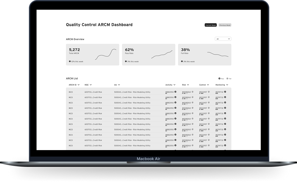
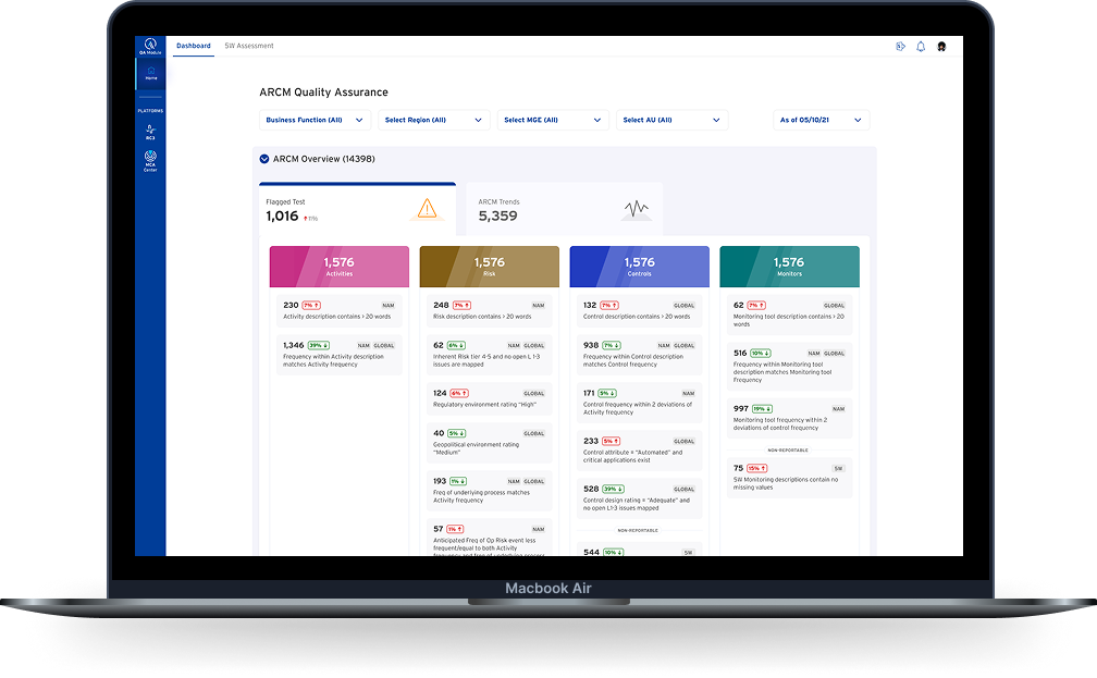
The high-fidelity UI got its own visual language: a color-driven system for ARCM status, a clear typographic hierarchy for dense data tables, and a personal work queue that replaced the entity-hierarchy maze of the legacy tool. I prototyped the key flows in Figma and ran rounds of usability testing with real analysts before anything went into the backlog.
The final product was an Angular web application. I worked closely with the engineering team throughout the build, reviewing implementations and making sure what shipped matched what we had designed together.
The outcome
Faster work, happier analysts.
Rollout happened gradually, region by region, with training and a feedback channel analysts could use at any time. The Excel workflow gradually disappeared as the new tool proved itself. What started as a pilot scaled to enterprise-wide deployment without needing to be rebuilt from scratch.
Beyond the headline numbers, the qualitative shift was the point. Analysts had transparent visibility into ARCM quality and flagged items for the first time. Embedded analytics helped enforce compliance with policy and procedures, making the right action the obvious one rather than a separate check. And the spreadsheets, slowly, disappeared.
What I took with me
Internal tools deserve consumer-grade design.
The hardest part of this project wasn't designing screens, it was making the case that risk analysts deserved the same care a consumer banking customer would get. The tools that move the most money in the world are often the ugliest ones, and that's a choice, not a constraint.
I also learned what it means to design for a domain you have to earn your way into. The ARCM world has its own language, its own logic, its own priorities, and the only way to design well for it was to understand it deeply before picking up a pen.
The win wasn't the dashboard. It was a quiet shift in how the org thought about its internal users, and a precedent that every internal tool that came after had to live up to.